
![]()
A bar chart (or a bar graph) is one of the easiest ways to present your data in Excel, where horizontal bars are used to compare data values. Here’s how to make and format bar charts in Microsoft Excel.
Inserting Bar Charts in Microsoft Excel
While you can potentially turn any set of Excel data into a bar chart, It makes more sense to do this with data when straight comparisons are possible, such as comparing the sales data for a number of products. You can also create combo charts in Excel, where bar charts can be combined with other chart types to show two types of data together.
We’ll be using fictional sales data as our example data set to help you visualize how this data could be converted into a bar chart in Excel. For more complex comparisons, alternative chart types like histograms might be better options.
To insert a bar chart in Microsoft Excel, open your Excel workbook and select your data. You can do this manually using your mouse, or you can select a cell in your range and press Ctrl+A to select the data automatically.
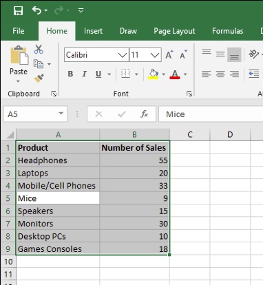
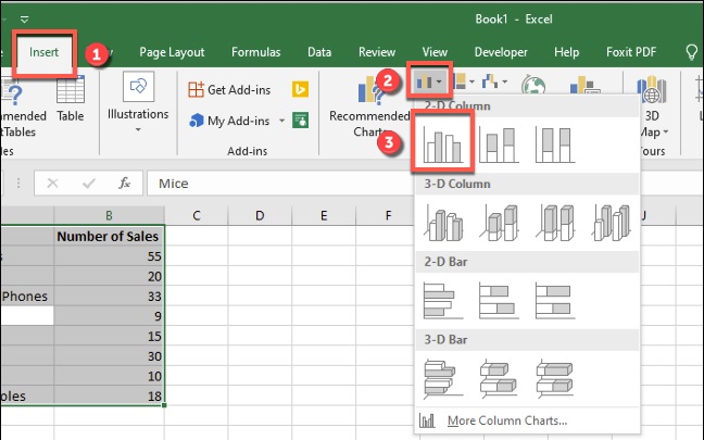
Once your data is selected, click Insert > Insert Column or Bar Chart.
Various column charts are available, but to insert a standard bar chart, click the “Clustered Chart” option. This chart is the first icon listed under the “2-D Column” section.
Excel will automatically take the data from your data set to create the chart on the same worksheet, using your column labels to set axis and chart titles. You can move or resize the chart to another position on the same worksheet, or cut or copy the chart to another worksheet or workbook file.
For our example, the sales data has been converted into a bar chart showing a comparison of the number of sales for each electronic product.
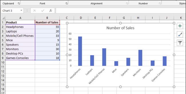
For this set of data, mice were bought the least with 9 sales, while headphones were bought the most with 55 sales. This comparison is visually obvious from the chart as presented.
Formatting Bar Charts in Microsoft Excel
By default, a bar chart in Excel is created using a set style, with a title for the chart extrapolated from one of the column labels (if available).
You can make many formatting changes to your chart, should you wish to. You can change the color and style of your chart, change the chart title, as well as add or edit axis labels on both sides.
It’s also possible to add trendlines to your Excel chart, allowing you to see greater patterns (trends) in your data. This would be especially important for sales data, where a trendline could visualize decreasing or increasing number of sales over time.
Changing Chart Title Text
To change the title text for a bar chart, double-click the title text box above the chart itself. You’ll then be able to edit or format the text as required.
If you want to remove the chart title completely, select your chart and click the “Chart Elements” icon on the right, shown visually as a green, “+” symbol.
From here, click the checkbox next to the “Chart Title” option to deselect it.
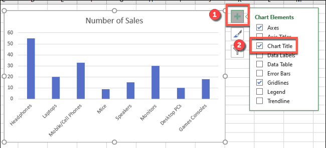
Your chart title will be removed once the checkbox has been removed.
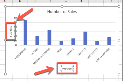
Adding and Editing Axis Labels
To add axis labels to your bar chart, select your chart and click the green “Chart Elements” icon (the “+” icon).
From the “Chart Elements” menu, enable the “Axis Titles” checkbox.
Axis labels should appear for both the x axis (at the bottom) and the y axis (on the left). These will appear as text boxes.
To edit the labels, double-click the text boxes next to each axis. Edit the text in each text box accordingly, then select outside of the text box once you’ve finished making changes.
If you want to remove the labels, follow the same steps to remove the checkbox from the “Chart Elements” menu by pressing the green, “+” icon. Removing the checkbox next to the “Axis Titles” option will immediately remove the labels from view.
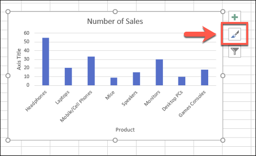
Changing Chart Style and Colors
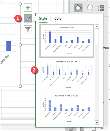
Microsoft Excel offers a number of chart themes (named styles) that you can apply to your bar chart. To apply these, select your chart and then click the “Chart Styles” icon on the right that looks like a paint brush.
A list of style options will become visible in a drop-down menu under the “Style” section.
Select one of these styles to change the visual appearance of your chart, including changing the bar layout and background.
You can access the same chart styles by clicking the “Design” tab, under the “Chart Tools” section on the ribbon bar.
The same chart styles will be visible under the “Chart Styles” section—clicking any of the options shown will change your chart style in the same way as the method above.
You can also make changes to the colors used in your chart in the “Color” section of the Chart Styles menu.
Color options are grouped, so select one of the color palette groupings to apply those colors to your chart.
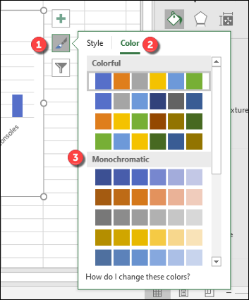
You can test each color style by hovering over them with your mouse first. Your chart will change to show how the chart will look with those colors applied.
Further Bar Chart Formatting Options
You can make further formatting changes to your bar chart by right-clicking the chart and selecting the “Format Chart Area” option.
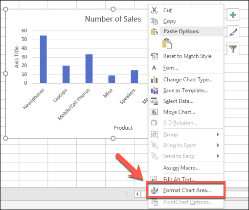
This will bring up the “Format Chart Area” menu on the right. From here, you can change the fill, border, and other chart formatting options for your chart under the “Chart Options” section.
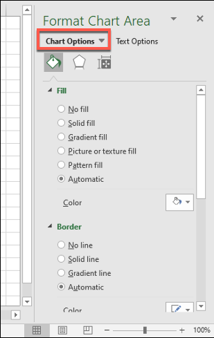
You can also change how text is displayed on your chart under the “Text Options” section, allowing you to add colors, effects, and patterns to your title and axis labels, as well as change how your text is aligned on the chart.
If you want to make further text formatting changes, you can do this using the standard text formatting options under the “Home” tab while you’re editing a label.
You can also use the pop-up formatting menu that appears above the chart title or axis label text boxes as you edit them.
How useful was this post?
- Share review with rating here: Google Review
We are providing practical training (Labor Laws, Payroll, Salary Structure, PF-ESI Challan) and Labor Codes, Payroll Consultant Service & more:
- HR Generalist Practical Training + Certificate: https://oneclik.in/hr-generalist-practical-training/
- Labor Law + Payroll Practical Training + Certificate : https://oneclik.in/labor-law-payroll-practical-training-certificate/ (PF, ESI, Bonus, Payroll & more)
- HR Analytics Practical Training + Certificate: https://oneclik.in/hr-analytics-practical-training-certificate/
- Labor Code, 2020 (Crash Course) + Certificate: https://oneclik.in/labor-code2020-rules-practical-training-certificate-crash-course/
- Advance Excel Practical Training + Certificate: https://oneclik.in/advanced-excel-practical-training-certificate/
- Disciplinary Proceeding & Domestic Enquiry – Practical Training + Certificate: https://oneclik.in/disciplinary-proceeding-domestic-enquiry-short-term-course-with-latest-updates/
- PoSH Act, 2013 (Sexual Harassment Of Women At Workplace & Vishaka Guidelines) – Practical Training + Certificate: https://oneclik.in/sexual-harassment-of-women-at-workplace-vishaka-guidelines-short-term-course-with-latest-amendments/
- Compensation & Benefits – Practical Training + Certificate: https://oneclik.in/compensation-benefits-practical-training-certificate/
- Industrial Relations – Practical Training + Certificate: https://oneclik.in/industrial-relations-practical-training-certificate/
- Labour Code (2019 & 2020) With Latest Updates | Labour Bill (Labour-Law-Practical-Training): https://oneclik.in/labour-law-practical-training/ (Factory, Contact Labor, Maternity Act & more)
- PF – ESI Consultant Service: https://oneclik.in/pf-esi-consultant-service/
- Labor Law, Compliance & HR – Payroll Management
Get Latest HR, IR, Labor Law Updates, Case Studies & Regular Updates: (Join us on Social Media)
- Telegram Channel: “One Clik”
- Whatsapp Group: https://wa.me/919033016939
- Facebook: One Clik
- Linkedin: One Clik
- Instagram: oneclik_hr_management
- YouTube: One Clik
Disclaimer: All the information on this website/blog/post is published in good faith, fair use & for general informational purposes only and is not intended to constitute legal advice.