
![]()
Histograms are a useful tool in frequency data analysis, offering users the ability to sort data into groupings (called bin numbers) in a visual graph, similar to a bar chart. Here’s how to create them in Microsoft Excel.
If you want to create histograms in Excel, you’ll need to use Excel 2016 or later. Earlier versions of Office (Excel 2013 and earlier) lack this feature.
How to Create a Histogram in Excel
Put simply, frequency data analysis involves taking a data set and trying to determine how often that data occurs. You might, for instance, be looking to take a set of student test results and determine how often those results occur, or how often results fall into certain grade boundaries.
Histograms make it easy to take this kind of data and visualize it in an Excel chart.
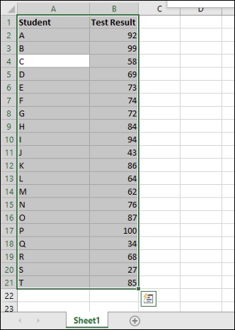
You can do this by opening Microsoft Excel and selecting your data. You can select the data manually, or by selecting a cell within your range and pressing Ctrl+A on your keyboard.
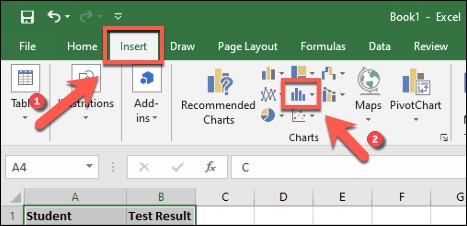
With your data selected, choose the “Insert” tab on the ribbon bar. The various chart options available to you will be listed under the “Charts” section in the middle.
Click the “Insert Statistic Chart” button to view a list of available charts.
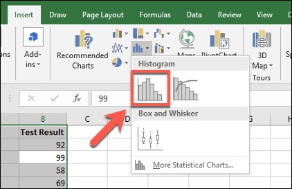
In the “Histogram” section of the drop-down menu, tap the first chart option on the left.
This will insert a histogram chart into your Excel spreadsheet. Excel will attempt to determine how to format your chart automatically, but you might need to make changes manually after the chart is inserted.
Formatting a Histogram Chart
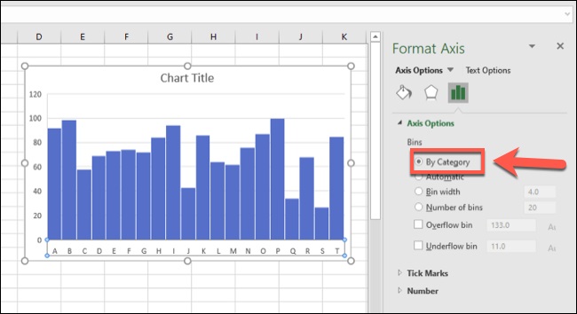
Once you’ve inserted a histogram into your Microsoft Excel worksheet, you can make changes to it by right-clicking your chart axis labels and pressing the “Format Axis” option.
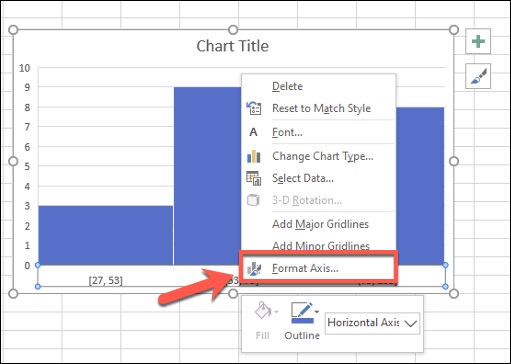
Excel will attempt to determine the bins (groupings) to use for your chart, but you might need to change this yourself. For instance, for a list of student test results out of 100, you might prefer to group the results into grade boundaries that appear in groups of 10.
You can leave Excel’s bin grouping choice by leaving the “By Category” option intact under the “Format Axis” menu that appears on the right. If you want to change these settings, however, switch to another option.
For instance, “By Category” will use the first category in your data range to group data. For a list of student test results, this would separate each result by student, which wouldn’t be as useful for this kind of analysis.
Using the “Bin Width” option, you can combine your data into different groups.
Referring to our example of student test results, you could group these into groups of 10 by setting the “Bin Width” value to 10.
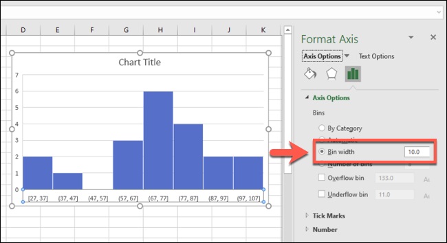
The bottom axis ranges start with the lowest number. The first bin grouping, for instance, is displayed as “[27, 37]” while the largest range ends with “[97, 107],” despite the maximum test result figure remaining 100.
The “Number Of Bins” option can work in a similar way by setting a firm number of bins to show on your chart. Setting 10 bins here, for instance, would also group results into groups of 10.
For our example, the lowest result is 27, so the first bin starts with 27. The highest number in that range is 34, so the axis label for that bin is displayed as “27, 34.” This ensures as equal distribution of bin groupings as possible.
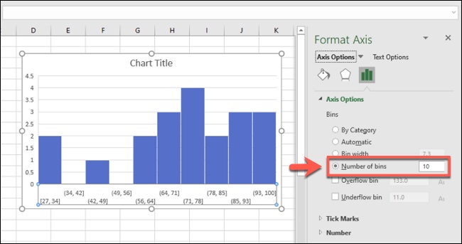
For the student results example, this may not be the best option. If you want to ensure that a set number of bin groupings are always displayed, however, this is the option you’d need to use.
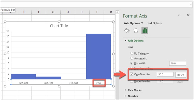
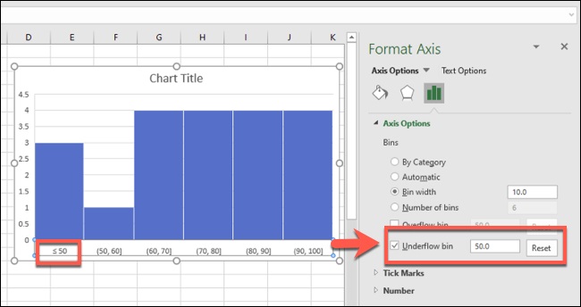
You can also split data into two with overflow and underflow bins. For instance, if you wanted to carefully analyze data under or above a certain number, you could tick to enable the “Overflow Bin” option and set a figure accordingly.
For example, if you wanted to analyze student pass rates below 50, you could enable and set the “Overflow Bin” figure at 50. Bin ranges below 50 would still be displayed, but data over 50 would be grouped in the appropriate overflow bin instead.
This works in combination with other bin grouping formats, such as by bin width.
The same works the other way for underflow bins.
For instance, if a failure rate is 50, you could decide to set the “Underflow Bin” option to 50. Other bin groupings would display as normal, but data below 50 would be grouped in the appropriate underflow bin section.
You can also make cosmetic changes to your histogram chart, including replacing the title and axis labels, by double-clicking those areas. Further changes to the text and bar colors and options can be made by right-clicking the chart itself and selecting the “Format Chart Area” option.
How useful was this post?
- Share review with rating here: Google Review
We are providing practical training (Labor Laws, Payroll, Salary Structure, PF-ESI Challan) and Labor Codes, Payroll Consultant Service & more:
- HR Generalist Practical Training + Certificate: https://oneclik.in/hr-generalist-practical-training/
- Labor Law + Payroll Practical Training + Certificate : https://oneclik.in/labor-law-payroll-practical-training-certificate/ (PF, ESI, Bonus, Payroll & more)
- HR Analytics Practical Training + Certificate: https://oneclik.in/hr-analytics-practical-training-certificate/
- Labor Code, 2020 (Crash Course) + Certificate: https://oneclik.in/labor-code2020-rules-practical-training-certificate-crash-course/
- Advance Excel Practical Training + Certificate: https://oneclik.in/advanced-excel-practical-training-certificate/
- Disciplinary Proceeding & Domestic Enquiry – Practical Training + Certificate: https://oneclik.in/disciplinary-proceeding-domestic-enquiry-short-term-course-with-latest-updates/
- PoSH Act, 2013 (Sexual Harassment Of Women At Workplace & Vishaka Guidelines) – Practical Training + Certificate: https://oneclik.in/sexual-harassment-of-women-at-workplace-vishaka-guidelines-short-term-course-with-latest-amendments/
- Compensation & Benefits – Practical Training + Certificate: https://oneclik.in/compensation-benefits-practical-training-certificate/
- Industrial Relations – Practical Training + Certificate: https://oneclik.in/industrial-relations-practical-training-certificate/
- Labour Code (2019 & 2020) With Latest Updates | Labour Bill (Labour-Law-Practical-Training): https://oneclik.in/labour-law-practical-training/ (Factory, Contact Labor, Maternity Act & more)
- PF – ESI Consultant Service: https://oneclik.in/pf-esi-consultant-service/
- Labor Law, Compliance & HR – Payroll Management
Get Latest HR, IR, Labor Law Updates, Case Studies & Regular Updates: (Join us on Social Media)
- Telegram Channel: “One Clik”
- Whatsapp Group: https://wa.me/919033016939
- Facebook: One Clik
- Linkedin: One Clik
- Instagram: oneclik_hr_management
- YouTube: One Clik
Disclaimer: All the information on this website/blog/post is published in good faith, fair use & for general informational purposes only and is not intended to constitute legal advice.