
![]()
A data series in Microsoft Excel is a set of data, shown in a row or a column, which is presented using a graph or chart. To help analyze your data, you might prefer to rename your data series.
Rather than renaming the individual column or row labels, you can rename a data series in Excel by editing the graph or chart. You might want to do this if your data labels are opaque and difficult to immediately understand.
You can rename any data series presented in a chart or graph, including a basic Excel bar chart.
To demonstrate, we have a basic bar chart showing a list of fruit sales on a quarterly basis. The chart shows four bars for each product, with the bars labeled at the bottom—these are your data series.
In this example, the data series are labeled alphabetically from A to D.
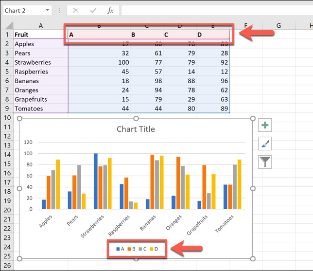
Labels such as these wouldn’t be hugely helpful for this example purpose, as you wouldn’t be able to determine the periods of time.
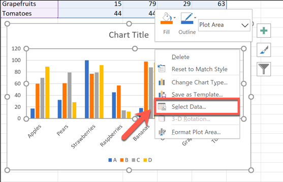
This is where you’d look to rename the data series. To do this, right-click your graph or chart and click the “Select Data” option.
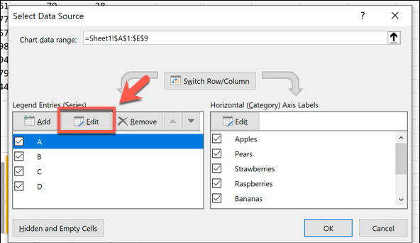
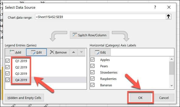
This will open the “Select Data Source” options window. Your multiple data series will be listed under the “Legend Entries (Series)” column.
To begin renaming your data series, select one from the list and then click the “Edit” button.
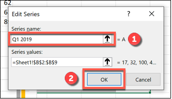
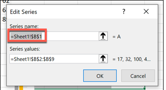
In the “Edit Series” box, you can begin to rename your data series labels. By default, Excel will use the column or row label, using the cell reference to determine this.
Replace the cell reference with a static name of your choice. For this example, our data series labels will reflect yearly quarters (Q1 2019, Q2 2019, etc).
You could also replace this with another cell reference if you prefer to use labels that are separate from your data. This will ensure that your chart updates automatically if you decide to change the labels shown in those cells at a later date.
Once you’ve renamed your data series label, click “OK” to confirm.
This will take you back to the “Select Data Source” window, where you can repeat the steps for each data series label.
If you want to restore your labels to the same as your column or row labels, repeat the steps above, replacing the static labels with the cell reference for each column or row label.
You will need to name the worksheet containing the label when you do this. For instance, using =Sheet1!$B$1 here would show the label in cell B1.
For this example, this would show the letter A.
This will mean that any changes to your column or row labels will also update the data series labels in your chart or graph.
Once you’ve renamed all of the data labels, click “OK” to save the changes.
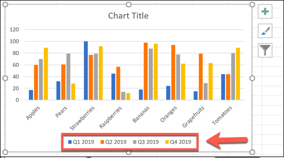
Your graph or chart will show your updated data series labels.
These are shown at the bottom of your chart, and are color-coded to match your data.
You can make further changes to the formatting of your graph or chart at this point. For instance, you could add a trendline to your Microsoft Excel chart to help you see further patterns in your data.
How useful was this post?
- Share review with rating here: Google Review
We are providing practical training (Labor Laws, Payroll, Salary Structure, PF-ESI Challan) and Labor Codes, Payroll Consultant Service & more:
- HR Generalist Practical Training + Certificate: https://oneclik.in/hr-generalist-practical-training/
- Labor Law + Payroll Practical Training + Certificate : https://oneclik.in/labor-law-payroll-practical-training-certificate/ (PF, ESI, Bonus, Payroll & more)
- HR Analytics Practical Training + Certificate: https://oneclik.in/hr-analytics-practical-training-certificate/
- Labor Code, 2020 (Crash Course) + Certificate: https://oneclik.in/labor-code2020-rules-practical-training-certificate-crash-course/
- Advance Excel Practical Training + Certificate: https://oneclik.in/advanced-excel-practical-training-certificate/
- Disciplinary Proceeding & Domestic Enquiry – Practical Training + Certificate: https://oneclik.in/disciplinary-proceeding-domestic-enquiry-short-term-course-with-latest-updates/
- PoSH Act, 2013 (Sexual Harassment Of Women At Workplace & Vishaka Guidelines) – Practical Training + Certificate: https://oneclik.in/sexual-harassment-of-women-at-workplace-vishaka-guidelines-short-term-course-with-latest-amendments/
- Compensation & Benefits – Practical Training + Certificate: https://oneclik.in/compensation-benefits-practical-training-certificate/
- Industrial Relations – Practical Training + Certificate: https://oneclik.in/industrial-relations-practical-training-certificate/
- Labour Code (2019 & 2020) With Latest Updates | Labour Bill (Labour-Law-Practical-Training): https://oneclik.in/labour-law-practical-training/ (Factory, Contact Labor, Maternity Act & more)
- PF – ESI Consultant Service: https://oneclik.in/pf-esi-consultant-service/
- Labor Law, Compliance & HR – Payroll Management
Get Latest HR, IR, Labor Law Updates, Case Studies & Regular Updates: (Join us on Social Media)
- Telegram Channel: “One Clik”
- Whatsapp Group: https://wa.me/919033016939
- Facebook: One Clik
- Linkedin: One Clik
- Instagram: oneclik_hr_management
- YouTube: One Clik
Disclaimer: All the information on this website/blog/post is published in good faith, fair use & for general informational purposes only and is not intended to constitute legal advice.